Face generation
All those faces...
The important part of Interregnum is that along as you take care of the kingdom and try to manage its politics, you are meeting many people. Some of them want something of you, some are there to help. What matters, we're talking about lots of potential characters. And that means lots of faces.
As much as I can enjoy designing every possible portrait, let's be honest — there are bigger things to take care of than that. Moreover - I wanted characters to be created randomly. So it's obvious that I would like some sort of face generator.
What is important with the way we present NPCs to the players is that we have to make sure that each can something that makes it stand out a bit. Having people with diverse looks feels more natural and helps players in distinguishing characters. In case of carefully crafted character design its easy to that each character is a bit different from each other, that in those differences they look natural. In case of random generation we can have a lottery where there are some pretty winner and well... *crickets*
When designing the face generation system I want to be sure there's enough diversity between faces, so there's a smaller chance a player can stumble upon NPCs that look the same. One way of ensuring this is playing with colours, the other composing the faces of parts - eyes, noses, etc. to have some diversity in shape. The more the characters stand out visually from each other, the better.
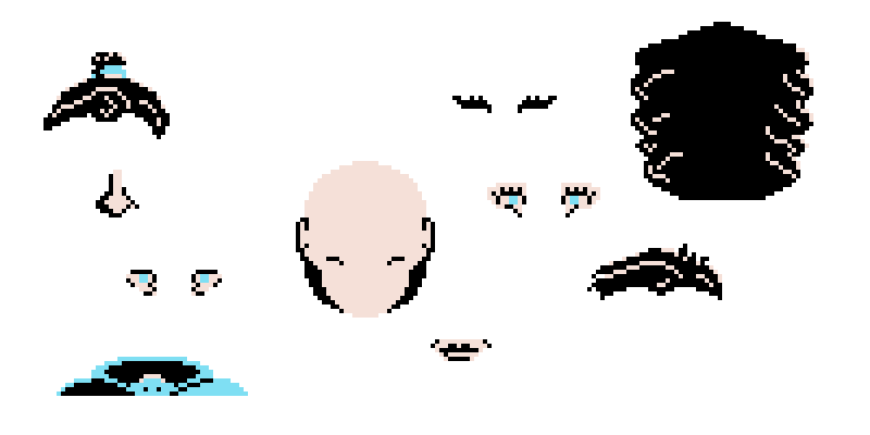
First thing I needed was some idea what parts were going to be separate. I narrowed down the list to:
- basic shape of the face,
- eyes,
- nose,
- mouth,
- hair,
- back of the hair,
- top of the torso.
The back of the hair was needed for a simple reason - that way I can multiple kinds of hairstyles that can go behind the head and torso. And because they are a separate element, I don't have to make a tie between them and the top hair, so I get more available hairstyles.
I assumed some of those elements would have male and female variants, some would be gender-neutral, and some mixed. For example, all bases are shared between the genders, eyebrows are mixed — some are shared, some are have separate male and female variants. But the most important were the elements that were going to be fully gender-specific, because I can use them to make the women and men stand from each other visually. I picked that eyes and mouth would be vital in this part.
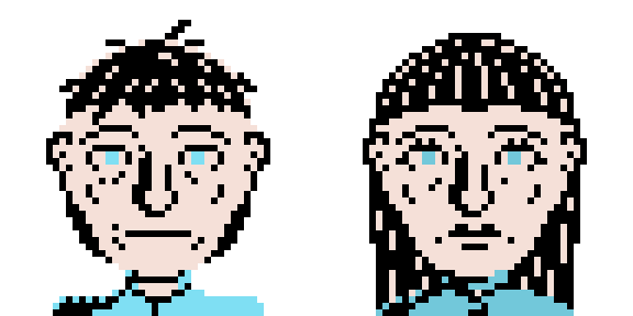
I decided to make the elements in Krita. To ensure the design is consistent, all elements appear in the same file, just on separate level, grouped by the element type. And so I ended up with two first faces designed:

From that point it wasn't that hard to draw more elements. And There's a big advantage in having so many elements - each option you add, it multiplies already available combinations.
In the end, when a character is created it gets a number of options for each element:
- basic shape of the face - 8,
- eyes - 5,
- nose - 8,
- mouth - 8,
- hair - 4,
- back of the hair - 4 (which gives 16 different hairstyles in total),
- top of the torso - 5,
which gives us... *drums* 204,800 different faces for each gender! Nice, and that's without playing with colours yet.

You can notice I used only three colours to make the pieces. That was a deliberate choice. First, at that stage I didn't want to overcomplicate the whole process, I also needed colours to help those elements stand out enough. I also planned to go for a pixel art and in case of combining those elements, it was more acceptable and easier to limit the colours. I also think a bit old-style feeling to those portraits gives them a bit of a charm.
In practice there are four colours. The first one is the skin/highlight, the second hair/dark. The third colour is for the details that can help to set the character out even more - eyes and colour of clothes. The fourth colour is supposed to be created when drawing - the background. It's purpose is to ensure the portrait won't blend in with the elements of the UI.
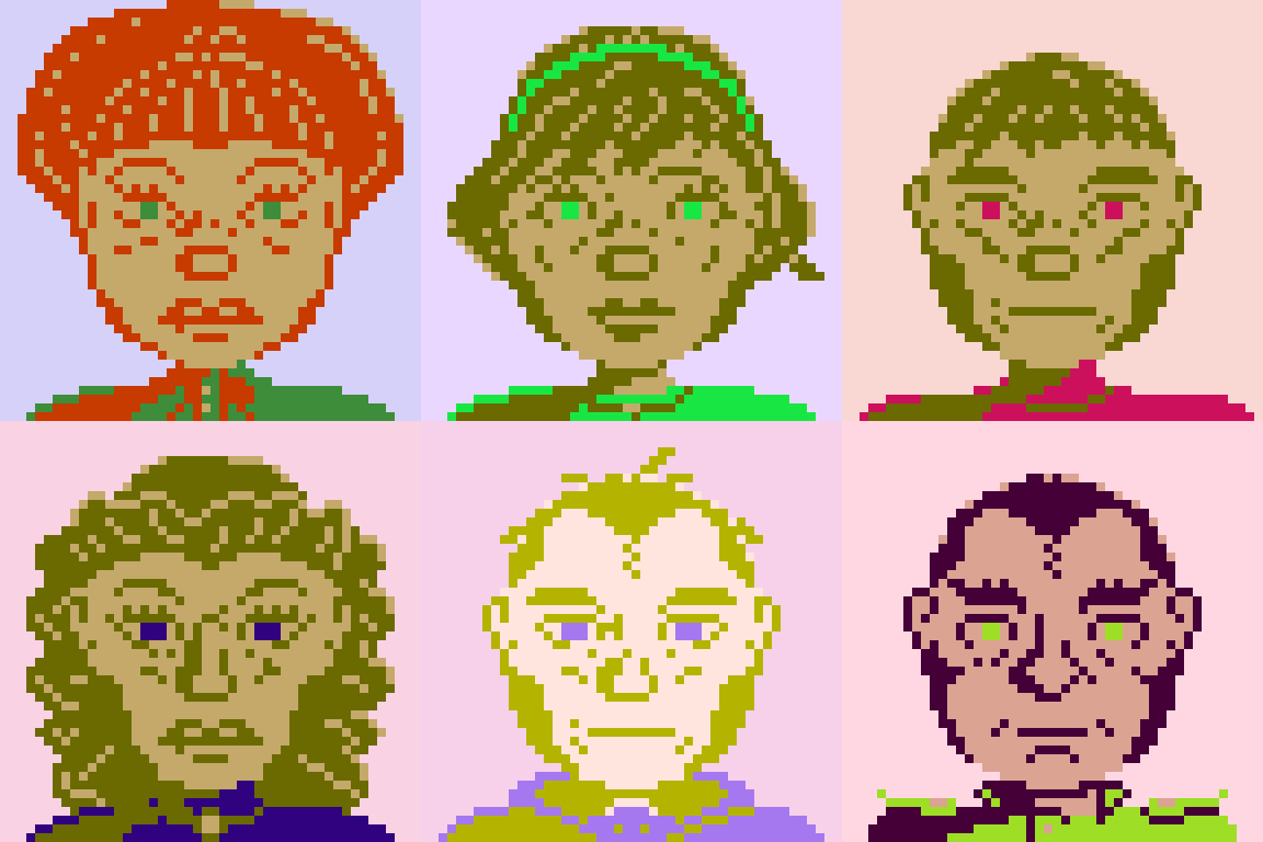
But you may ask, "hey, you still have assets in only those four colours!" and you'd be right. What I did I wrote a shader in GameMaker that takes as an input two palettes - the original one and the target one and remaps the colours. That way I can achieve even more diversity with much less work.
What I also wanted to play around, is to give the characters some nice tint. So I needed to figure out some ways of ensuring that both skin and hair colour feel natural (more or less), and that the background colour would not blend in with them too much (turns out it's much harder than I thought). There's a big drawback to the amount of colours I used. While it feels old-style, the mixing of highlights with skin and hair with dark sadly can turn out looking very weird. In the end I had to provide a rule that the hair always has to be darker than the skin.

Overall, I'm quite happy with the way the faces turned out to be. I mean, just check out for yourself:

Interregnum
Interregnum,
| Status | In development |
| Author | swefnox |
| Genre | Strategy, Simulation |
| Tags | Pixel Art, Singleplayer |
Leave a comment
Log in with itch.io to leave a comment.